I recently introduced website visualisation maps. This is a tool I find incredibly useful for understanding how websites (and apps) are structured for designing web analytics tracking and performing analysis. Within the blog post, I made the offer to create a free website visualisation for one business, as long as I could share afterwards.
I had someone offer a challenge with the Volkswagen Belgium website (more details below). The results can be seen with a lot of detail involved but, in my opinion, matched by an understandable structure.
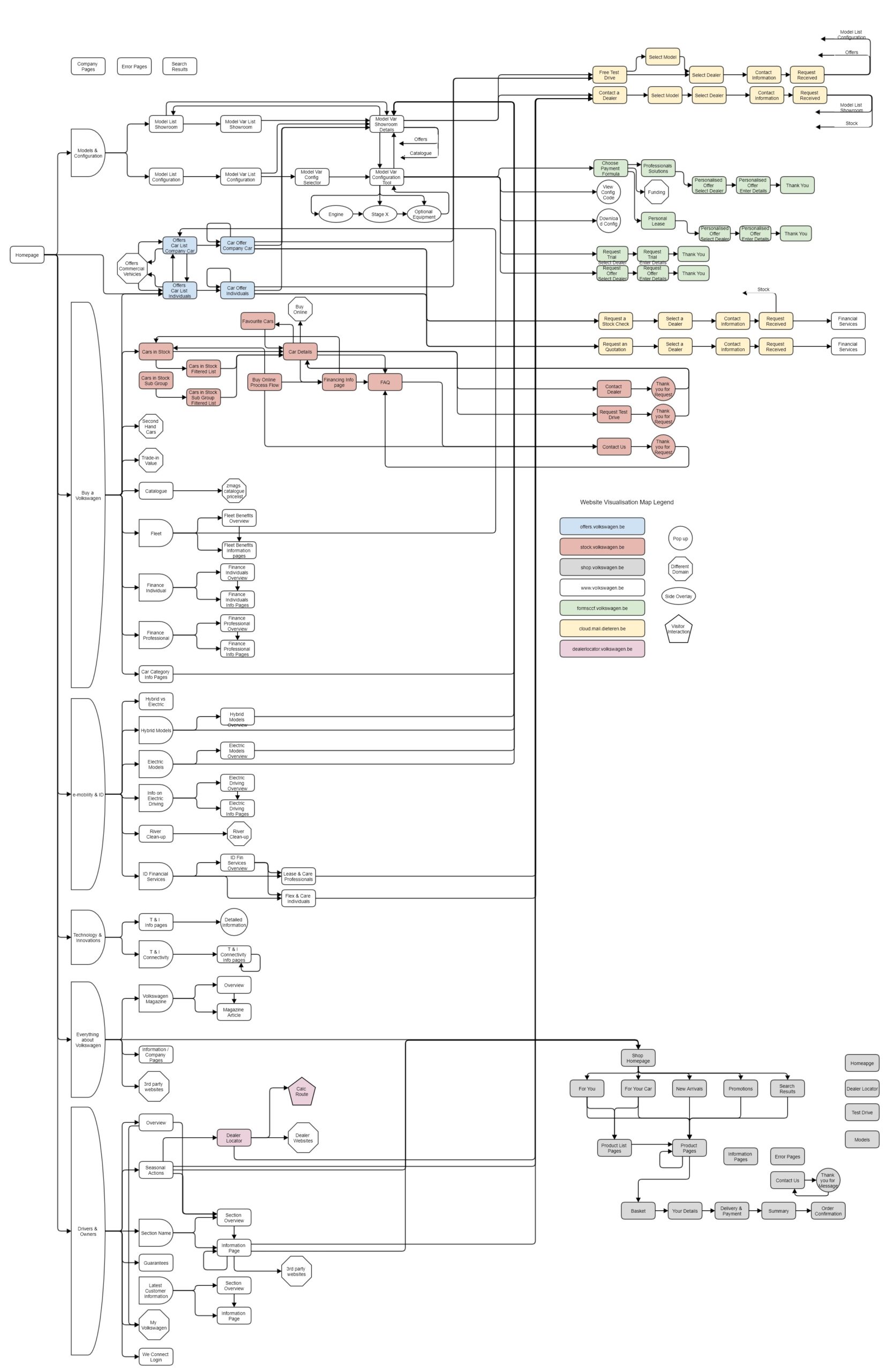
The different conversion processes can be clearly seen. The data for each can be used to identify drop-off points, with changes made to plug those leaks. Comparing the conversion processes suggests there are duplicates – the website could be simplified (with the solution hosted on the Volkswagen domain).
Clicking through to the conversion process flows is a simple method for evaluating success for key pages within the website e.g. the car model variant pages. The level of success can be used to understand if these actions are signposted clearly enough for different page types. It can also be used to compare between individual pages of a page type, to identify those that are underperforming and need work to bring them up to the level of internal benchmarks.
With the paths marked out as they are within this website visualisation, these can be mapped against actual user behaviour from web analytics data. It will highlight where visitors get lost or don’t navigate within the website as expected. These insights can be used to improve page layouts, CTAs and the content included within pages.
The challenge
After making the free offer in my original blog post, I was surprised that no companies wanted to take advantage of it. After putting out some reminders, I eventually had a response and I had the feeling it was a deliberately difficult challenge…

While Jente mentioned three domains originally, we ended up with seven included within the visualisation. That was almost a relief as there were even more Volkswagen domains that were out of scope.
There was a large language barrier. The website was in French and Dutch, I don’t speak either. Google Translate became a good friend but it did mean I couldn’t rely upon URLs as a guide to where a page belonged in the website.
As would be expected for a brand like Volkswagen, their website has a lot of content – plus there were those seven domains the content was spread across. Jente did ask how complex the website could be and there was a good reason for that question.
My offer included a requirement to have access to the web analytics tool of the website. That allows me to use content and navigation reports as another way to explore the website. In this case, with the request coming through an agency working with Volkswagen, that was not possible. Jente did extract a list page names from the web analytics tool and I agreed to proceed with this limitation.
Page names
The list of page names is a really important tool in creating a website visualisation map. You should be able to identify every page from the list on the visualisation – it is a great way of testing it for completeness.
The initial data extract was of the top 5,000 page names. But there might be a page type with one page view of each of 500 different variations (think confirmation page if it includes the transaction ID) so that is not enough. I need all page names. The initial extract was for a month so the simple solution was to reduce the date range down to a week.
I discovered that the page names were actual Page URLs, excluding query parameters. User friendly page names should be a MUST for every web analytics implementation. To make life easier, I:
- Removed the URL protocol
- Split the domain and page path into two columns
- Removed all French versions of pages, leaving just the Dutch
The list was then sorted by domain name and then by page path. This made it much easier to identify patterns. Filters were retained so I could display only one domain or a subset of pages.
I did discover that without the query parameters, some pages were grouped together. Frustratingly, this was especially the case during various conversion processes e.g. to sign up for a test drive.
Process followed to create the visualisation
The best way to get started with a website visualisation is to get started. I opened the website (in Chrome so I could easily translate to English) and got out my paper & pencil.
I drew a box labelled Homepage.

The top navigation menu was the obvious place to start. I went through each menu option, clicking through to pages and clicking through until I reached an end point, making notes as I went. This initial version was rough & ready. I didn’t check all the details, let alone list them all down on my visualisation. There were whole sections I noted as “information pages”.
This rough first draft taught me a few things:
- The website was very complex
- Key pages were the starting point for multiple conversion actions, all of which are important to be mapped out
- Clicking on items within the menu often opened more menu options instead of displaying a page
- Given the size of the menu, the website would be easier to visualise if rotated sideways
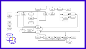
This led to a second attempt with paper and pencil. You can immediately see that this version looks cleaner, even thought it is only partially complete.
I used a different shape to represent menu items that opened a new menu option. A different shape was also used for websites outside the agreed domains e.g. second hand Volkswagens.
I started to map out the conversion actions from the car showroom and car configuration page nodes. This quickly led me to realise that there was more complexity here than I could fit on an A4 page. Hence the partial nature of this diagram and the switch online to Gliffy.

Before I started on my official version, I had to clarify one point with Jente. The Make of the car was a Volkswagen and there were multiple Models listed e.g. up!, New Polo, T-Cross. However the cars displayed one the key car pages were one level deeper as per below. How are these referred to internally?
It is important to replicate business language within your website visualisation map, it makes it much easier to read. The response in this case was to call them Model Variants.

With that resolved, it was onto building a more complete map within Gliffy. I had my rough drafts to start with but it quickly required me to revert to clicking through page after page on the website. This enabled me to map out the full conversion processes and there were a fair few of them.
The information pages were easier, I simply decided to group them together as much as possible. This is not ideal as there are different actions available on different information pages but this felt the reasonable short-term solution. A future more detailed version of this visualisation map would start separating these pages but it was not important at this stage.
The challenge was that any page could suddenly lead to a mini-important visitor journey with conversion actions. This kept me focused to attempt to identify all of these options. Within Gliffy, the map kept getting more complicated with visitor paths crossing over. Whenever that happened, I increased the height of the map (and menu option) and moved page nodes around to reduce this complexity.
It took a long time but I finally hit a link through to the shop section/subdomain of the website. Given my recent reviews of ecommerce websites, it felt good to have a section that I was familiar with. There were still some decisions to be made on the structure, particularly around which top level pages to combine into page nodes.
I filtered my list of page names on the shop subdomain and reviewed to ensure all pages did appear on the map. This exposed the Product List pages which I had not realised existed. It also caused me to add a few different stand-alone pages such as the Dealer Locator and Test Drive pages.
This technique helped with visualising pages within the stock subdomain as well. There are various filtered versions of the cars in stock list pages, whether through a sub group or a filter being applied. Without access to the web analytics tool, I can’t tell how the “Cars in Stock Sub Group” pages are accessed or triggered. But it is on the visualisation map.
I admit that I should have also compared the list of all pages on the www subdomain against the visualisation map. Given the time put into the map to that stage, I decided to skip the step. This visualisation map is not complete, it needs shading in around the edges. But for the purposes of a free offer for Volkswagen and this blog post, it is close enough.
Visual hints within visualisation map
I also made some more decision as to the visual aspects of the visualisation map:
- The page nodes for each domain have a different coloured background
- Different shapes were used to represent side overlays, pop-ups, key visitor actions & paths to domains outside the scope of this visualisation map
- Where there was a return to start link at the end of a website conversion process flow, I included a shortened arrow and label to reduce the number of lines going back & forth

How I would use this visualisation
It might look pretty but is there any real value in this. From my point of view, it is a yes (I am biased). Without discussions with Volkswagen, here are some suggestions for how the visualisation map could be used in different ways.
Immediate improvements to website
Reviewing the website and the visualisation map, there is no apparent reason for separate showroom and configuration processes. These could be combined into a single set of pages with two options for each model variant, to view details in a showroom or to configure the car.
There also appear to be duplicate conversion process flows on different domains e.g. requesting a test drive. Process flows like contact the dealer and request a test drive could be combined with one form option allowing the visitor to select the purpose of the request.
In all cases, these processes should be moved to the Volkswagen domain, keeping the visitor in one place and providing more accurate data without cross domain tracking.
Improve web analytics tracking
The most obvious use of a visualisation map to improve tracking is to translate it into a page naming convention. Unless Jente was deliberately trying to make my life difficult, this website doesn’t have one. With this structure, one could easily be designed that meets the three key requirements:
- Every page has a unique page name
- Page names have a hierarchical structure reflecting location in website
- Page names are intuitive so anyone reviewing a pages report can easily identify a page based on the page name
French and Dutch pages would have the same page name too, with the language captured in a different variable. This would make analysis easier with a larger data set available (due to combined data).
The website visualisation highlights that conversion actions are being initiated across the websites. These include clicking to:
- commence the test drive or contact a dealer process
- access a 3rd party website
- download documents
All conversion actions, both the initial click to start a process and the completion of a conversion action need to be tracked, if they aren’t currently. This needs to happen in such a way that reporting on % split between different options on a page or group of like pages is easy to do.
Website Improvements Based on Analysis
These are opportunities to modify and improve website performance but where analysis of data is required to do so. The points in the visitor journey where the opportunity lies was highlighted through the website visualisation map.
One positive outcome from the new page names would be the ability to view conversion process flows page by page. This is currently not possible. It would allow Volkswagen to identify where in each process people are dropping out helping to identify causes of this.
A list can be created of all conversion processes in combination with the page types used to access each conversion process. The completion rates for each can be compared to understand which combinations are underperforming with an investigation into why.
While there are a limited number of page types that initiate key conversion actions, these typically have multiple pages. For instance, the model variant showroom details page type has a page for each model variant. The key page types identified of this nature are:
- Model variant showroom details
- Model variant configuration tool
- Cars in stock – car details
- Car offer – company car
- Car offer – individual
If success is clicking to commence a conversion process for each of these page types, the individual pages can be compared to understand which are successful. Underperforming pages are identified as needing work (e.g. rewrite the copy, use better images) to bring performance in line with internal benchmarks.
Given the number of information pages on the website, they should all be listed out along with the key desired action to be taken from each page. Again, this information can be used to identify which pages are underperforming and need work. It is also a useful sense check as to whether that action is logical for that page.
Given the existence of an ecommerce shop on the website, the standard ecommerce techniques of creating the Website Funnel and the Merchandising report should be taken. The first uses five numbers to identify the weakest stage of the ecommerce shop and the second uses two numbers per product to identify which products to feature and which
Extending the visualisation further

As mentioned earlier, this website visualisation map is not entirely complete. The details around the edges need shading in and I am conscious of missing elements. For reference, actions that I would take to complete the visualisation are:
- Add in the missed promo links from the navigation menu
- Integrate the search results page into the map rather than just listing it
- The information page sections need to be expanded to list the different sub sections
- Review and list out the different actions from more pages on the website, especially those information pages
- Review the pages report to ensure all pages listed appear in the visualisation
- Expand the visualisation to include all other Volkswagen domains
With a final step of sitting down with Volkswagen Belgium stakeholders to review and agree the visualisation reflects the website accurately.
Do you want your own website (or app) visualisation map?
What do you think? Can you understand my confusion that every company doesn’t have their own website visualisation map?
These visualisation maps can lead to direct website changes, once you can see what the website looks like laid out. More likely, it highlights areas where improvement are possible once some analysis of the data is performed. This can lead to significant website improvements, potentially in areas you were not previously aware of as opportunities.
Get in touch if you want a website (or app) visualisation map for your business. It is a critical action in improving the use of data and, from there, the performance of your business.