
Workshop: Website Visualisations
Summary of the 1st lunchtime Digital Analytics workshop. The topic was website visualisation maps with the deck used and answers to audience questions included here.
Author: Peter O'Neill
Summary of the 1st lunchtime Digital Analytics workshop. The topic was website visualisation maps with the deck used and answers to audience questions included here.

This is the recording from the Weekly Workshop held on the topic of the Ecommerce Funnel. It is a tool I have used for many years to diagnose Ecommerce website and I explain all the details within this video.
Your web analytics tool can capture every detail of visitor behaviour on an ecommerce website but what you need to get started is much less. This implementation guide is targeted to the critical information and associated reports only.
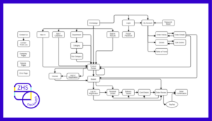
A detailed run through of the creation of a website visualisation map for the ZHS Orchards website, explaining why pages were grouped and visitor paths were included.
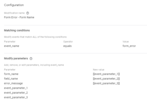
Custom event parameters can't be passed through to GA4 using a single event tag in GTM. The solution is to use standard event parameter names, renaming parameters to custom names within GA4.
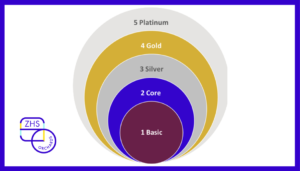
Website visualisation maps are the best method to understand how a website is structured. This understanding is critical for analysis of visitors and their behaviour so that business performance can be improved.

It is important to modify your language to that used by others, to ensure you are understood. I used polls to gather feedback on the right terms to use to describe the work I do, leading me to decide upon website data and digital data.

The website Performance Diagnostic is an ugly data puke of a report. It is also the most powerful way of identifying actions, using internal benchmarks & informed by data, to improve business performance.

The Retail Merchandise report is a tool used with online retailers for years to improve sales. It highlights products that need changes and products to promote, actions that should be taken daily but made smarter through the use of data.

The first two blog posts in this series explained attribution and then why it was flawed. So the finale needs to provide the solution, an alternative approach to optimising your marketing spend.